The biggest mistake in creating QR Codes is overlooking creative design. Injecting creativity can be a make-or-break factor in getting those scans. But fret not; you’re in good hands! In this blog, we share expert advice on how to transform unattractive QR Codes into showstopping marvels, leading to more scans in no time!
10 creative QR Code design best practices
Crafting QR Codes to make them aesthetically stand out requires attention to the little details. QR Codes have a fixed structure, but you can still make them unique by customizing their design—in fact, we encourage you to personalize the square as much as possible.
Pay attention to the details
Edges
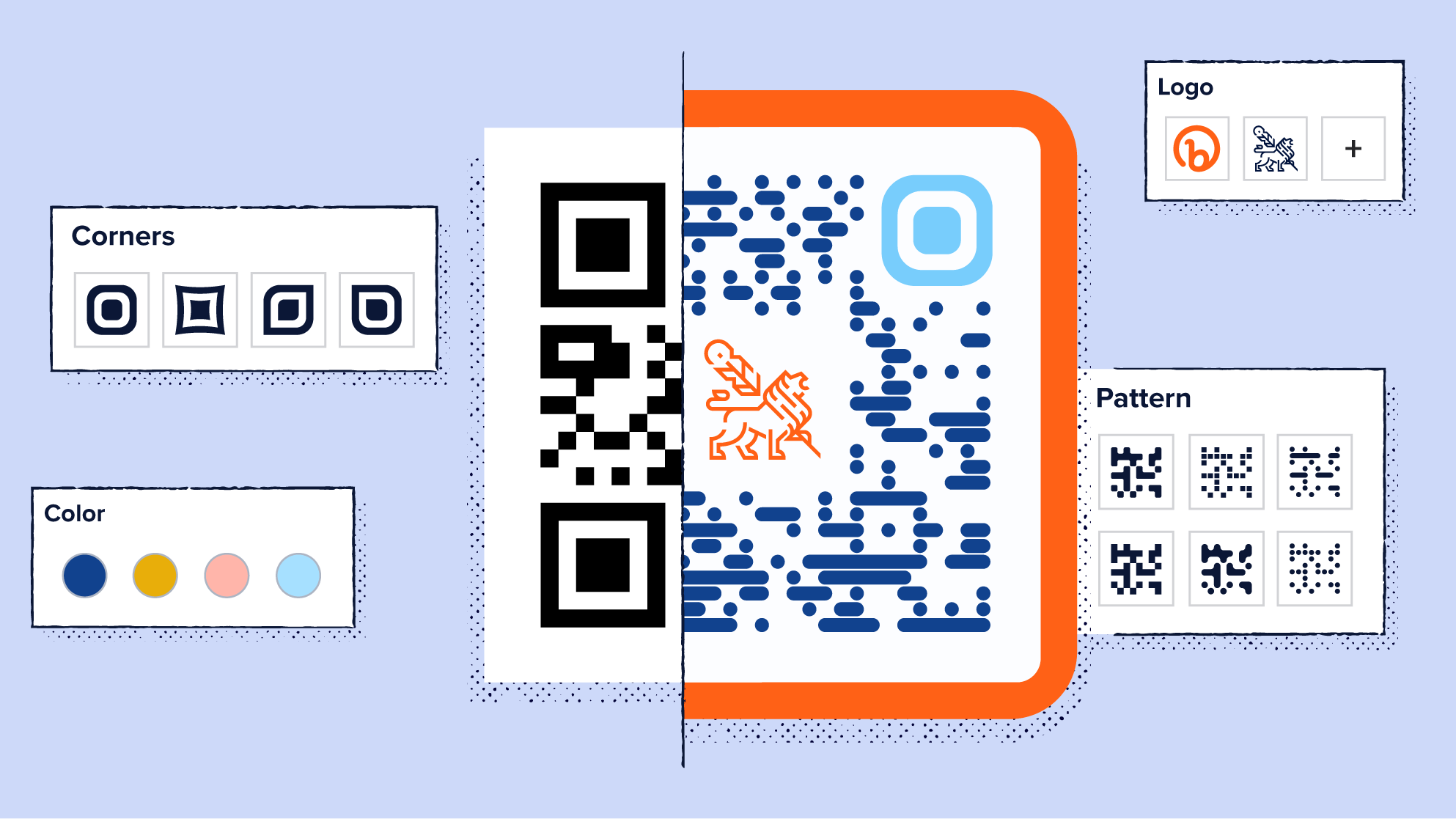
Each QR Code has three corners on its periphery, often referred to as position detection markers. These markers can take various shapes, including squares, ovals, and circles. Select a shape that complements the overall square pattern to enhance its appearance.
Style pattern
A variety of patterns make up the structure of your square, from Testris-styled patterns to dotted ones. Choose the one that represents your brand’s style and the marketing medium you plan to use with your QR Code.
Maintain a quiet zone
The quiet zone is the empty space surrounding the QR Code, serving as a frame that maintains the square’s structure. When printing it, ensure that there’s enough white space so that the QR Code remains scannable. As a rule of thumb, a quiet zone should be at least four times larger than the width of your QR Code modules (those little black pixels forming a grid pattern on the QR Code).
Use color
Colors can evoke specific emotions, so don’t hesitate to go beyond black and white. For instance, if you’re creating a poster with an orange and black color scheme, use the same hex color code to match your QR Code precisely.
Pro tip: Whenever possible, consider using your brand’s core colors to enhance brand recognition.
Employ high contrast
While we encourage you to explore colorful options, there’s a logical reason behind the effectiveness of monochromatic black and white squares: these colors create a strong contrast, enhancing the QR Code’s readability. The white background highlights the black foreground of the QR Code, making it visible.
Following this color principle, consider pairing your brand color with its complementary color to maximize visibility and scannability.
Hot tip: Opt for a lighter background and a darker foreground.
Print high resolution
Make sure you print your QR Code image in high resolution. The reason is simple: blurry or distorted images may not scan properly. Before finalizing, double-check the resolution and perform a round of scan tests at the intended print size of the QR Code, ensuring it remains sharp and clear.
Avoid manipulating the structure of the QR Code
QR Codes can be scanned vertically or horizontally, but excessive reshaping can distort them and make them unreadable. A good idea is to avoid making too many changes when you customize it.
Pro tip: Make sure to try scanning it on various devices after any tweaks to ensure it still works.
Add a call-to-action frame
A call-to-action (CTA) frame prompts users to scan your QR Code and gives them a visual cue to do so. The frame is the sole spot on the square where you can include text. Given its limited size, craft concise, compelling copy that sparks a firebolt response from your targeted audience. Consider this: What message would compel your audience to scan your QR Code?
Include a logo
Much like how your brand’s colors are a strong representation, logos are a key aspect of your brand identity. But your logo goes a step further by conveying your brand’s values. So, when you position your logo at the center of your QR Code, it not only helps people instantly recognize your brand but also encourages them to scan the QR Code associated with it.
Take size to ratio into account
Businesses use QR Codes on a wide range of marketing materials, spanning from massive billboards to tiny menu cards. Consequently, the QR Code size varies significantly depending on the marketing medium. The minimum scan-to-distance ratio for QR Codes is 10:1, and this ratio increases as the distance grows.
The farther the QR Code is from the audience, the larger the square needs to be for it to be visible to the naked eye and scannable by a smartphone camera. However, as a general rule of thumb, consider a minimum QR Code size of at least 2 cm by 2 cm (about 1 in by 1 in) and adjust it as needed.
Use one QR Code per ad
Opt for a single QR Code on your advertising material to keep things user-friendly. This way, you won’t risk confusing your audience with multiple codes. It’s a smart move that maximizes your resources and ensures a straightforward experience for your users.
Hot tip: Design a creatively enhanced QR Code with Bitly’s customization features!
7 QR Code design use cases
Keeping our creative QR Code design best practices in mind, we’ve curated a list of use cases from our design library. Try using these examples as a template for your own QR Code designs.
Plus, with the merge of the Bitly-Canva integration, you’ll have all the digital tools and inspiration you need!
Product packaging
The secret to seamlessly integrating your creative QR Code design into your packaging is to make it an integral part of the overall package design rather than a separate element.
Look at Betty Baker’s coffee bean packaging, for example. Its vibrant red color captures the festive spirit of the holiday season, and this theme extends to the QR Code, which also features red and white.
Notably, the pixelated square employs highly contrasting colors: red in the foreground and white in the background. This deliberate choice enhances the QR Code’s visibility and readability. Every detail, from the typography to the delicate white snowflakes, is meticulously crafted, demonstrating a commitment to creativity.
Take inspiration from this beautifully designed packaging—it’s a testament to the power of thoughtful design, ensuring that your QR Code seamlessly complements your product’s aesthetic.

Find more use cases for QR Codes on product packaging here!
Flyers
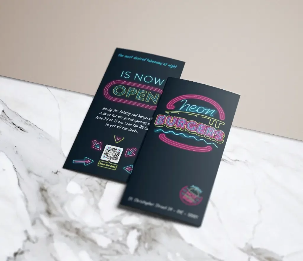
Embrace the power of QR Codes to transform your flyer from static to dynamic. They create an interactive portal, making your flyer engaging and unforgettable. Neon Burger’s design exudes modernity by featuring vibrant neon colors, instantly conveying the essence of its eclectic brand.
The neon-inspired colors provide a striking contrast against the almost matte black background, infusing their design with flair and creativity. The neon arrows are like playful signposts that guide the audience’s attention, not-so-subtly pointing toward the QR Code.
Even the QR Code itself embraces the neon trend, with its edges in neon blue and magenta pink and a glowing neon yellow “Save the date” CTA.
This flyer is a fantastic example of how to blend a modern, digital approach with clever and creative QR Code design principles, leaving a lasting impression on your audience.
Billboards
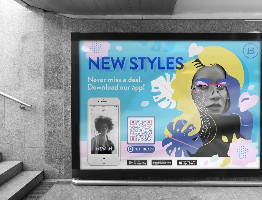
Ella Boutique’s captivating billboard has a simple yet powerful aim: encouraging users to download their app. They opted for a single QR Code, which proved more than sufficient since it redirects users to the appropriate link, catering to both Android and iOS users.
The entire billboard is a work of art featuring soft pastel colors that stay true to their brand and vividly showcase their stylish identity. The QR Code seamlessly integrates with the brand’s colors, ensuring a cohesive and harmonious look.
With its purple frame and pixelated pattern set against a white background and a touch of pink along the edges, it serves as a fantastic inspiration for retail brands looking to create equally striking advertisements.
Vehicles
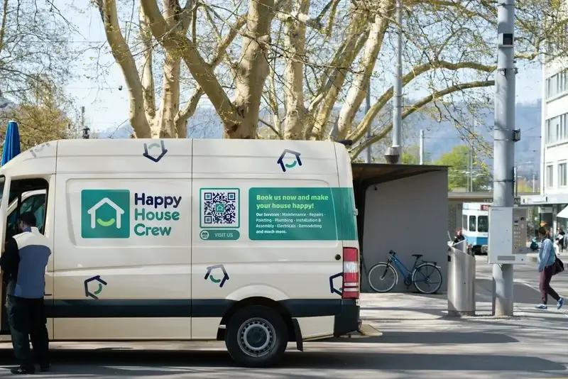
By using your vehicle as a moving advertisement, you have ample space for a scannable QR Code. The Happy House Crew, for example, placed a brand-friendly QR Code on their van to connect with local clients during their daily routes.
Adding such a code to your vehicle is a clever and cost-effective way to catch the eye of daily commuters and passersby, providing more opportunities for customers to engage with your brand.
Happy House Crew’s van is adorned with their distinctive dark blue, turquoise, white, and green colors, along with their iconic house logo. This same branding is mirrored in their QR Code, with the house logo at the center and the brand colors in the pattern, edges, and frame of the code. The CTA succinctly conveys the ad’s objective: gaining more customers.
If you already use a vehicle for your business, consider incorporating a QR Code to streamline the decision-making process for potential clients.
Windows
Storefront windows can be a powerful tool to attract potential customers to your restaurant, cafe, or retail shop. Signs with messages like “SALE” or “50%” can quickly catch the eye of passersby. However, windows also offer an opportunity to provide essential information, such as business hours or special deals.
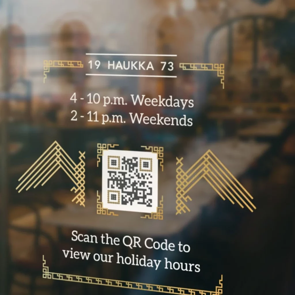
For instance, Haukka, a restaurant, used a section of their window to display their holiday season business hours. Customers could easily access this information by scanning the QR Code provided.
The square features a black and gold design against a white background, aligning with Haukka’s brand colors. This design choice effectively extends their brand identity, with the golden patterns in the QR Code matching the restaurant’s unique style.
This classy and creative QR Code design exemplifies how small brand details can be incorporated into your pixelated square, making it a memorable and inspiring addition to your storefront.
Banners
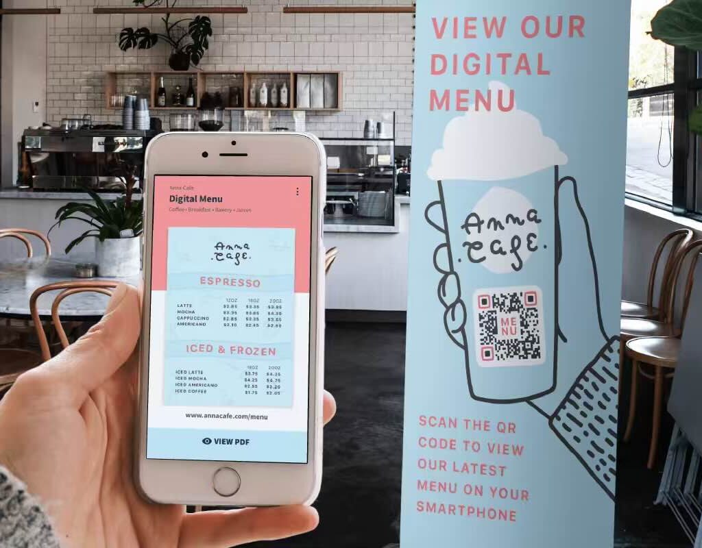
Banners serve multiple purposes in out-of-home (OOH) advertising, marketing campaigns, and promotions. In the case of Anna Cafe, they’ve cleverly used a banner to replace their traditional menu. They’ve integrated a QR Code into the banner, offering users instant access to a digital menu on their mobile devices.
This banner sets a shining example of QR Code design best practices. The pixelated square seamlessly blends into the illustration of a takeaway Anna Cafe cup, creating a cohesive and visually appealing design.
The harmonious baby blue and pink colors flow from the digital menu on the smartphone to the banner and the QR Code itself.
Business cards
Believe it or not, business card exchanges still hold value in our technologically advanced world. However, that doesn’t mean you can’t infuse them with digital innovation. Combining tradition with modernization can breathe new life into your business card, ensuring it’s more than just a piece of paper.
This is where contemporary graphic design principles and a small QR Code square come into play, paving the way to the future.
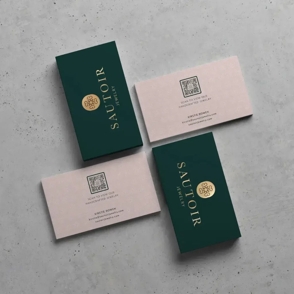
Just look at Sautoir’s business card—it exudes class and elegance with minimal text, complemented by a QR Code that opens a link to promote their jewelry products.
The Sautoir logo isn’t just on both sides of the card; it’s also at the center of the QR Code, fostering brand recognition. This clean and unique design makes the business cards something people are eager to pick up.
Let this serve as your inspiration for enhancing your own business card, combining tradition and innovation to leave a memorable impression.
The benefits of creative QR Code designs
Effective QR Code design goes beyond aesthetics; it’s a powerful tool that can boost brand recognition, increase conversion potential, and deliver numerous other benefits. Let’s dive deeper into these advantages below for a better understanding of their impact and potential.
Activates brand recall
When customizing your QR Code, strive to include your brand colors and company logo to transform your pixelated square into a valuable brand asset. Consistency is key in branding, regardless of where you are in your branding journey—whether you’re a newcomer or an established brand.
This consistency, even in QR Codes, offers a chance to build strong brand recognition, ultimately leading to more scans and conversions. Embrace this opportunity to make your brand shine across all your communication channels.
Attracts more scans
In a world overflowing with ads, both online and offline, grabbing your audience’s attention is getting tougher by the day. Crafting cool ads or marketing campaigns demands creativity and thinking outside the box.
The goal is to make some noise and draw your audience into captivating digital experiences that leave them excited and satisfied. If you settle for run-of-the-mill QR Codes, you’ll just blend into the background.
But when you bring in smart design and catchy text (CTA) along with engaging digital content, you can create a jaw-dropping experience for your audience. And that’s what will get you more scans and make your brand shine.
Affordable
Marketing, whether it’s online or offline, often comes with a hefty price tag. But here’s the inspiring part: when you weave QR Codes into your campaigns, you can seamlessly merge both worlds, even on a tight budget.
The best part? These QR Codes are a breeze to create, even in bulk. Plus, on the Bitly Connections platform, you can keep a real-time check on scan data, giving you valuable insights into how your campaign is doing.
This data helps you gauge your ROI (return on investment) over time, making your marketing efforts smarter and more efficient. So, don’t break the bank; get creative with QR Codes and make the most of your marketing budget!
How to create a creative QR Code design
1. Sign up or log into your Bitly account.
2. Click on Create New and select QR Code or press letter the Q on your keyboard.
3. Drop your link in the destination URL and other details about your code. Select Design your code once you complete this step.
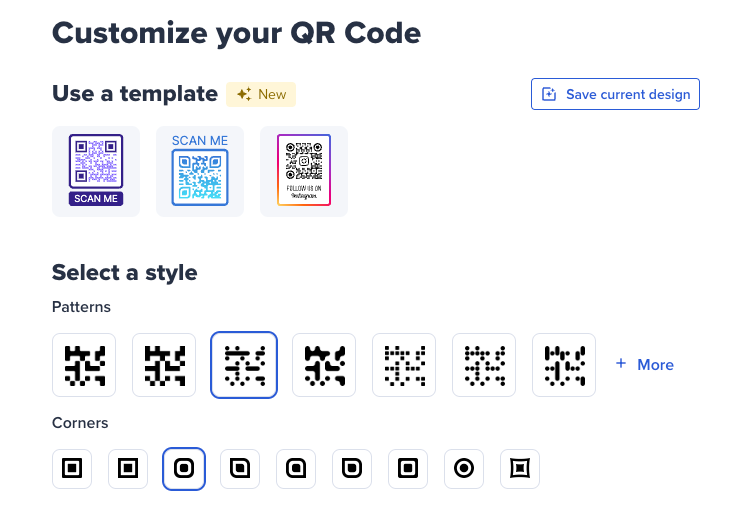
4. Start customizing your code by selecting a template or starting from scratch. Then choose the Patterns and Corners for your code.
5. Choose your colors for the Code and Background. Pick Preset colors or copy and paste your hex color codes.
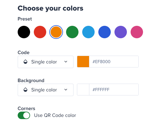
6. For the Code, you can select one of two options: Single color or Gradient. For the Background, you can select one of three options: Single color, Gradient, or Transparent.
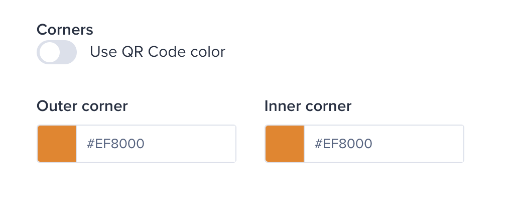
7. To have your corners match the Code color, simply toggle to the right to select Use QR Code color. To change the colors, simply toggle to the left to adjust the Outer corner and Inner corner colors.
8. Then choose the logo for your QR Code. You can either upload your brand logo, select a social media icon, a custom text, or a Bitly logo.
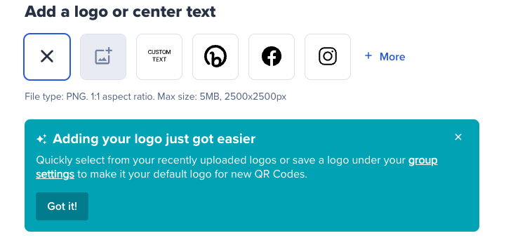
9. After, choose a frame. You can also add a Frame text (CTA), and a Frame color depending on the frame.
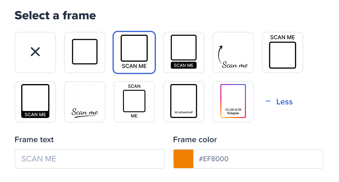
10. On the right side of the screen, you’ll see a preview of your QR Code. Once you’re happy with the result, select Create your code.
11. Your creative QR Code design is ready! Select either Download, Copy code, Customize, or copy the link.
Make your designs stand out with Bitly
Apply these creative QR Code design best practices using Bitly’s customization features so you can amplify your audience reach with QR Codes that turn heads.
Sign up today and unleash your inner creativity!
