Collecting feedback is one of the most effective ways to better understand your audience and improve your brand. Customers can provide valuable insights into what works and needs improvement, allowing you to make the best decisions for your business.
Of course, how you ask for feedback can determine whether or not you get it. To boost your response rates, learn how to create a landing page.
While there are numerous use cases for landing pages, we focus specifically on feedback collection here. A landing page is suitable for hosting surveys and polls, as it provides a focused, distraction-free environment that can encourage participation.
In this post, we look at the value of landing pages dedicated to surveys or polls and provide optimization tips to help increase conversions.
Why use landing pages for surveys and polls?
We know what you’re thinking—why create a different web page when you can distribute customer satisfaction surveys via email or host them on your website? Well, the problem with sending surveys via email is that you don’t get a lot of space to explain why recipients should offer their feedback. After all, 66% of people prefer short emails to long ones. Your website isn’t any better since it’s most likely too cluttered and can distract your audience from your goal—feedback collection.
This makes it important to create a dedicated landing page. Here are some reasons to use one:
- It removes distractions and makes it easier for visitors to focus on completing surveys and polls.
- It offers a lot of flexibility in terms of design, branding, and structure, allowing for a more customized experience—you can include elements like your business’s colors and logo to align it with your brand.
- It can increase response rates by guiding visitors to a single action—completing your survey or poll.
- It allows you to include a broader range of content, including text, videos, and images.
Advantages of landing pages dedicated to surveys or polls
There’s no question about the value of landing pages designed to collect feedback. They offer offer numerous benefits, including:
Focused user experience
People are busy and easily distracted, so it’s important to provide a distraction-free environment to help visitors focus on your survey. That’s exactly what a landing page does.
Since it has fewer elements than a typical website homepage, it provides a cleaner, simpler interface. This increases focus and can boost completion rates, helping you get more insights into what you can improve or maintain to keep your audience happy.
Customization and branding opportunities
As mentioned before, landing pages offer a lot of flexibility. They allow you to fully customize your survey or poll experience, promoting consistency with other marketing materials and brand messaging. This can help improve both recognition and engagement.
Some customization ideas for aligning brand identity include:
- Incorporate your brand colors into the landing page.
- Maintain consistent messaging and tone throughout the page.
- Use the same fonts as you do in marketing materials.
- Add your logo to the page.
- If you have custom graphics or brand imagery, incorporate them into the page.
Data collection and analytics
Landing pages allow for advanced tracking and analytics, helping you discover valuable insights into your target audience.
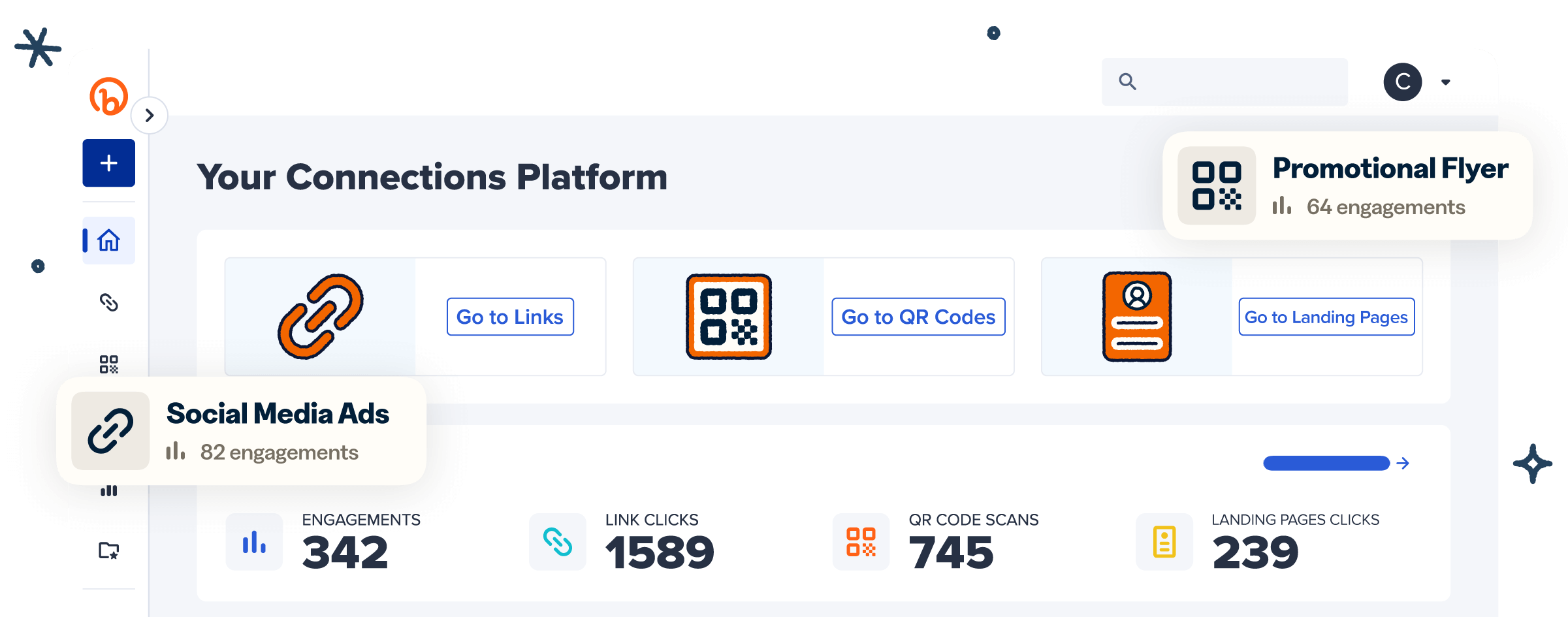
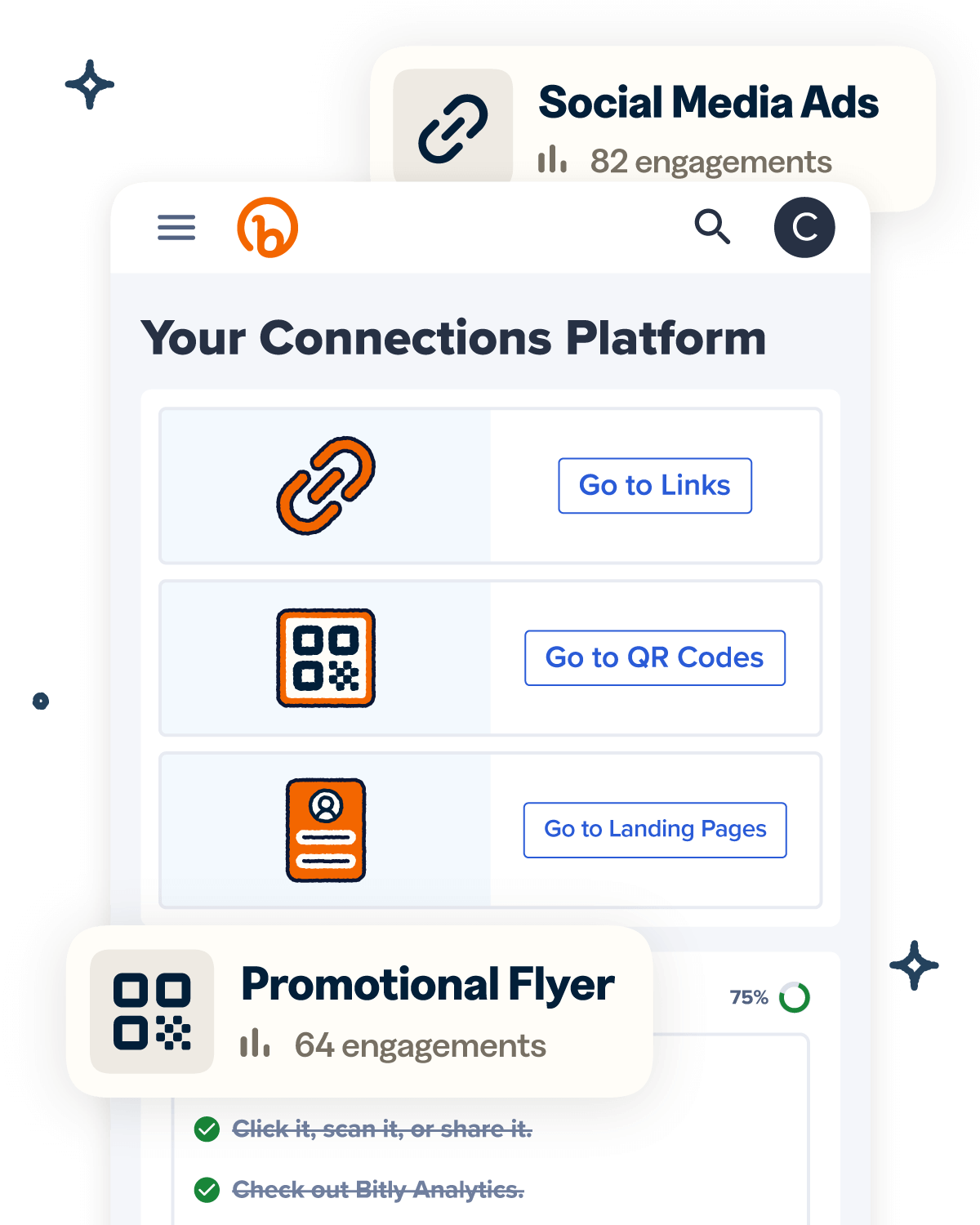
Take Google Analytics or Bitly Pages, for example. They provide end-to-end analytics, showing how often recipients view and click your landing page, their locations, and the pages’ traffic sources. This data can reveal what resonates most with your audience, helping you improve future landing page elements. It can also help refine your geographic targeting strategy and identify the most effective marketing channels.
You can get even more analytics if you leverage Bitly’s solutions for survey distribution, too. When you embed Bitly’s short links or QR Codes for surveys, you not only streamline distribution but also get to see how your target audience interacts with your requests. You’ll receive analytics on the total clicks and scans registered and clicks and scans by location, referral source, and device, again giving you a better understanding of your customers.
More opportunities for interactive content
Sometimes, customers need a little convincing to offer feedback. Cue interactive content that explains how their responses help you serve them better.
Landing pages provide opportunities to integrate engaging content, like videos, infographics, and images, to support your text. The value of visuals can’t be overstated—they can increase engagement by as much as 94%, as they prompt visitors to stay longer on a page. They can also communicate your purpose for the survey better, encouraging customers to complete it.
How to make an effective landing page for a survey or poll
How you create your landing page will determine survey responses. Here’s a step-by-step guide to help you increase survey engagement and completion rates:
1. Decide on the goal of the page
Start by identifying your primary goals. Do you want to understand customer satisfaction, gather feedback on your product, collect demographic information, or simply grow your email list?
Your goal will determine everything from the type of landing page to create to its design and the nature of your quizzes. For example, if you want to collect customer information, you’ll need to create a lead generation page; if you want to gather feedback on a specific product, you should include visuals of the item on the page; and if you want to gather feedback as well as collect customers’ contact information, you can display a sign-up form as your pop-up and let your landing page focus on the survey.
Identifying your primary goals allows you to invest in the right elements from the beginning.
2. Choose a survey tool
Once you’re clear on your goals, choose a survey tool that integrates well with your landing page builder. Beyond integration, consider factors like:
- Security: You or your customers may disclose confidential information during feedback collection. Find a tool that prioritizes security through measures like data encryption and regular audits.
- Ease of use: The last thing you want is to spend a lot of time trying to figure out how to use your survey tool, as this can cause delays. So, pick one with a simple and intuitive dashboard and resources like reliable customer support and FAQ sections.
- Customization: Choose a tool that lets you tweak available templates to match your brand identity and meet feedback collection goals.
- Question types: Find a tool that supports everything from open and closed questions to rating and multiple-choice ones to cater to your unique survey needs.
- Data analysis and reporting: Ensure your chosen tool can handle both quantitative and qualitative data as well as allow you to create visual data representations.
Some great survey tool options include Google Forms, Typeform, and SurveyMonkey. These tools meet the above factors and can streamline feedback collection and analysis.
3. Craft simple and relevant questions
Once you pick your tool, start creating survey questions. Keep them short and simple to avoid overwhelming recipients and make it easy for them to respond.
Also, keep your survey length short—a good rule of thumb is to make sure your survey takes no more than 10 to 14 minutes to complete. To keep it short and manageable, only ask questions that align with your goals. For example, if you want to collect opinions on a specific product, focus on questions relevant to the item.
You can also use engaging form fields like multiple-choice questions, sliders, or quick-response options to streamline the process. Respondents are more likely to complete your survey or poll if it’s easy to do so.
4. Build a user-friendly, mobile-optimized design
With 63.38% of web traffic coming from mobile devices, it’s more than likely that most survey respondents will offer feedback via phone. So, create a mobile-optimized landing page design that provides a seamless experience.
One of the best ways to optimize your landing page is to simplify navigation with a clean layout and large buttons. Also, keep your text short to avoid line breaks and reduce your page’s load time to three seconds to minimize bounce rates.
With Bitly Pages, you don’t have to do too much to optimize your survey landing page. Our pages are always mobile-optimized, making it easy for your audience to access them on the go.
5. Write strong calls to action (CTAs)
Even with great content, it can be difficult to get people to respond to your survey if you don’t have a call to action. A CTA ties everything together, guiding visitors on what to do after they open your landing page.
For effective results, keep your CTA short, direct, relevant, and inviting. It should also be action-oriented and create a sense of urgency. Some great examples include “Share Your Opinion” and “Take the Survey Now.”
6. Track your engagement rates
Monitor conversion rates regularly to determine how recipients interact with survey requests. Tracking engagement can help you with A/B testing, allowing you to identify distribution channels and landing page elements that best resonate with your target audience.
To calculate your conversion rates, divide the number of completed surveys by the number of visitors to the landing page. Bitly can help you with the latter—when you use Bitly Links or Bitly Codes, you receive real-time data on the number of people who click your survey link or scan your code.
If your completions and click numbers don’t match, monitor visitors’ behavior on your landing page to determine where they drop off in the survey. Doing this can help you identify potential barriers to completion. For instance, if you find that respondents drop off at question three, it could be that the following questions are too complex, that your survey is too long, or that there’s an issue with survey functionality. Knowing the reasons for incomplete surveys can help you improve future versions.
Make data collection easier with engaging survey landing pages
Landing pages are valuable for surveys and polls as they create a smoother, more focused experience for participants, which can increase conversions. Of course, their success depends on how well you create them—ensure they align with your goal, include vital elements like CTAs, and regularly track and optimize their performance.
Bitly’s suite of tools can help improve participation and tracking, ensuring more meaningful data collection for future campaigns. Bitly Pages streamlines landing page creation, short links and QR Codes allow for easy survey distribution, and Bitly Analytics provides real-time insights into recipients’ interactions with your landing page. Talk about getting everything under one roof!
Sign up for Bitly today to create high-converting landing pages for online surveys and track their performance for continuous optimization!


